 I have picked 14 fonts off of the website www.dafont.com that I think would aid my magazine. The font and what it would look like as the masthead is in the first row, and the name of the font for example ‘Calibri’ is in the second. The third column I have labelled my opinion, where I have looked at the font and written down the first thing that I think of. By doing this, I am acting as a random member of the public who is looking at the masthead of the magazine for the first time and mimicking their thoughts. For the fourth row I have asked twenty people to mark their favourite three fonts, these people were all aware that ‘Impact’ will be a chart music magazine, and all people were the age of my target audience. Finally the fifth column is to show the results of the tally chart.
Wednesday, 16 March 2011
Fonts For Masthead
I have picked 14 fonts off of the website www.dafont.com that I think would aid my magazine. The font and what it would look like as the masthead is in the first row, and the name of the font for example ‘Calibri’ is in the second. The third column I have labelled my opinion, where I have looked at the font and written down the first thing that I think of. By doing this, I am acting as a random member of the public who is looking at the masthead of the magazine for the first time and mimicking their thoughts. For the fourth row I have asked twenty people to mark their favourite three fonts, these people were all aware that ‘Impact’ will be a chart music magazine, and all people were the age of my target audience. Finally the fifth column is to show the results of the tally chart.Tuesday, 15 March 2011
Third Double Page Spread Design

Second Double Page Spread Design

First Double Page Spread Design

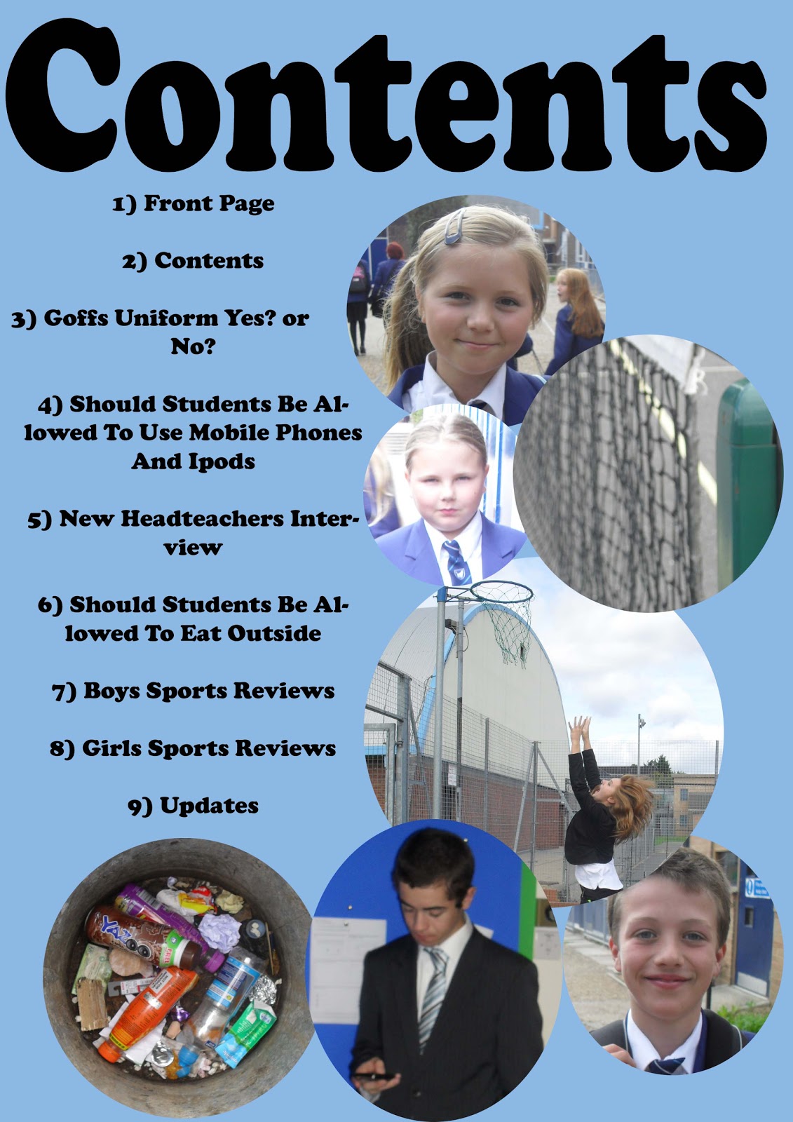
Third Contents Page Design

Second Contents Page Designs

First Contents Page Design

Third Front Cover Design

There are six small thumbnail photographs down either side of the page, and although there are still cover lines, this will be the substitute for most of them. The banner at the top of the page, will have a small amount of text to aid the main cover line.
Second Front Cover Design

The main image takes up most of the page, and the background of the image becomes the background of the magazine. Polaroid's surrounding the page slightly obscure the image and this may not be a good idea, but they can be moved to the side of the page if this is a problem. The cover lines appear on the bottom left hand side of the page, as according to my research, this is where they regularly appear.
First Front Cover Design
 This is the first front cover. It contains, from top to bottom, a skyline, masthead, main image, cover lines, a main cover line and a bar code and date area. The masthead is on the left hand side of the page, as due to my research, this is where i have found out that most masthead appear as this is one of the the firsts thing that people look at.
 The main image takes up the whole of the page, and the background for the page is the background of the image. The cover lines surround the neck/shoulder area of the model and the main cover line is going to obscure the image slightly however, you will
still be able to clearly see beneath it.
Monday, 7 March 2011
Questionairre Results
These are the results at the time I am reviewing them. There are a total of 15 answers per question.
Gender?
Male – 5
Female – 10
Double the amount of people who have filled in my questionnaire were female, so my magazine is going to have a female edge to it, but in general it is going to be aimed at both males and females.
How old are you?
13-16 – 8
17-20 – 4
20-30 – 3
30+ - 0
The biggest age range for the people that have filled in my questionnaire is 13-16 however the 17-20 age range is also quite popular. I am going to make the target audience age for my magazine 13-20 as according to my research this is the age range of people who but music magazines.
What type of music do you like?
Chart Music – 9
Rock – 3
R+B – 2
Pop – 1
This concludes that a magazine that is based on chart music is going to sell the best, and this is the type of music that I am going to base my magazine on.
Which title do you prefer?
Bam – 5
Impact – 9
Notes – 1
Future - 0
The answers from my questionnaire show that Impact is the most successful name for my magazine, and as I am still undecided myself on what name to use, this is the name that I am going to use for my magazine.
How much would you pay for a magazine?
£1.50 - £2 – 4
£2.01 - £2.50 – 11
£2.51 - £3 – 0
£3.01+ - 0
The most popular answer for how much people would pay for a music magazine is £2.01 - £2.50 and this is the average price for other magazines that are on the Market. As my magazine is going to be a fortnightly magazine, I believe that this is an acceptable price to charge.
Sunday, 6 March 2011
Simple Initial Ideas
Title - I have limited my title for my magazine down to four possible options; they are Impact, Future, Bam and Notes. I am undecided on what name to use so I have included this as part of my questionnaire and I am going to use the answer that most people vote for.
Story - There are four option that i could have for a story in my magazine. New Upcoming Artist, New Album Interview, Awards for Artists and Music Reviews. I am going to use New Upcoming Artist for the base of my double page spread. I am using the breakthrough artist Jessie J as inspiration and my name for my artist is going to be Leah, either spelt Leah, Lia or Lea.
Images - There are two different options for the style of the main images that are going to be used. The images are either going to have a rock chick feel to them, also similar to Jessie J, or they are going to have a girly feminine feel to them. However by using the latter, it might not appeal to males.
Fonts - I am going to use the font website www.dafont.com to find what different fonts i can use and which ones apply to my magazine.
Colours - I am definitely going to use black and white as part of my colour scheme, but at the moment i am undecided on what other colour to use. However i do know that i am not going to use red as this has already been done many times.
Target Audience

This is Lauren, she is eighteen years old and lives in London. She has just finished her A levels and is going to be attending university to study fashion photography in the Autumn. She enjoys fashion, and loves to read different fashion magazines so that she can see what type of clothes are popular. However she also has her own individual fashion sense and like to wear leather jackets, flowery clothes ect. Lauren enjoys socialising with her friends, and they all enjoy going to clubs and parties, and wherever she goes she will always be carrying her Ipod, which she updates with new songs regularly. She can also play the piano at a Grade 5 level, however she takes “Rockschool” exams, as these are more modern and mean that she can play modern music, as this is what she enjoys.
Lauren enjoys listening to chart music, and regularly listens to artists such as ADELE, Jessie J, Rihanna, Pink, Kesha ect. She watched TV shows such as 90210 and Americas Next Top Model, and she regularly watched MTV. She enjoys listening to most types of music, but mainly listens to music that is in the charts.
The target audience for my magazine is going to be level D and E according to the NRS System, but will also stretch to some people in C2. Personally I think mainly students will buy this magazine and categories D and E are the ones that students fall into. In general, students do not have much money, so I will have to make sure that my magazine is not too expensive, or it will not be bought. If the magazine was a weekly magazine I think that £1.80 would be an acceptable price, compared to if the magazine was fortnightly then £2.80 would be an acceptable price to charge.
Contents Page
Subscribe to:
Comments (Atom)